The Quiet Palette: Why Olympus Natural Mode Belongs in British Grey
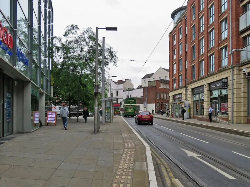
Photo: John Sutton , CC BY-SA 2.0, via Wikimedia Commons
British light is rarely a parade. It is a conversation held at low volume: grey-green fields, pearl skies, wet slate, the soft bruise of a cloud over a hill. Olympus Natural mode is one of the few camera colour profiles that seems to understand this. It does not shout. It does not turn every mossy wall into a neon salad. It gives you a file you can work with.
Grey is a colour, not a failure
Most camera presets are designed for sunshine. They assume blue skies, hard shadows and saturated flowers. Britain often gives you none of those things. It gives you low contrast, damp air, green-grey foliage and skies that fade from white to slate without passing through a memorable sunset. Under those conditions, punchy presets can look like a costume. Grass turns radioactive. Skies go cyan. Stone loses its grit.
Natural mode takes the opposite approach. It treats subtlety as the subject, not as a problem to be fixed. That is not the same as dullness. British light has enormous tonal nuance — the difference between wet limestone and dry limestone, between a grey sky and a grey sea, between a green jacket and a green door. Natural mode leaves enough room for those differences to breathe.
What Natural actually does
Natural sits near the middle of the Olympus picture-mode range: moderate saturation, moderate contrast, restrained sharpening. It is not the flattest profile — that is Muted — and it is not a neutral log curve. It is a sensible starting point for JPEGs that look like the scene without looking asleep.
- Vivid adds saturation and contrast. Under grey skies it can make grass look radioactive and skies look painted.
- i-Enhance adjusts automatically. It is convenient, but it can be inconsistent in mixed light.
- Muted lowers saturation and contrast. It is useful for grading, but flat straight out of camera.
- Natural is the honest base. A little tuning brings it to life without turning it into a different scene.
Recipes for overcast landscapes
Start with Picture Mode Natural, Contrast +1, Saturation +1 and Sharpness -1. Set Gradation to Normal. Cloudy white balance can add a little warmth to a grey day; Daylight keeps things cooler. Try exposure compensation at +0.3 to +0.7 if the scene is sitting in the shadows, and watch the live histogram so the sky does not clip.
This works well on Peak District gritstone, Lake District slate and the Yorkshire coast in November. The aim is not to make a grey day look sunny. It is to keep the texture of wet rock, the separation between moss and stone, and the soft weight of the clouds. A polariser can help cut glare from wet rock, but use it gently on grey skies; too much and the clouds lose their shape.
If you are using Auto White Balance, switch off Keep Warm Colour. It can push skin tones and stonework too far towards amber when the light is already murky. Cloudy white balance is a more deliberate choice: it says you want warmth, rather than letting the camera guess.
Street recipes without the flat
For street work, start with Natural, Contrast 0, Saturation 0, Gradation Normal and Sharpness -1. Use Auto White Balance with Keep Warm Colour off, and set exposure compensation to -0.3 to protect bright shop windows and wet reflections.
The 17mm f/1.8 and 25mm f/1.8 are ideal here. They are small, fast and unobtrusive, and they let you get close enough to the colour accents that make a grey street sing: a red bus, a yellow coat, a green café front, the orange glow of a灯 inside a window. Natural mode lets those accents do the work. You do not need to boost everything to make one thing stand out.
If you want a signature, use Color Creator to pull green slightly towards olive rather than pushing saturation across the whole frame. That keeps the British palette intact while giving the image a point of view.
Keeping JPEGs natural without going flat
Flatness usually comes from low contrast and low saturation working together. Keep one of them up. Gradation Normal is a better default than Auto in high-contrast scenes, because Auto lifts shadows and can kill depth. For JPEGs, Contrast +1 and Saturation +1 are often enough. Use Highlight & Shadow Control with shadows +1 and highlights -1 if you need to open the dark parts without losing the sky.
Shoot RAW alongside JPEG if you can. It gives you the option to revisit a file later, especially when the light is changing fast. In post, add local contrast or clarity sparingly. Avoid dehaze on grey skies; it can turn soft British light into something hard and foreign.
The grey advantage
Grey light is a gift for texture and nuance. It lets colour appear in small doses. It rewards patience, close looking and a willingness to let a scene be quiet. Olympus Natural mode is a quiet palette for a quiet island. It is not anti-colour. It is pro-subtlety — and in Britain, that is usually the right argument.