Crowns of Wool: Hunting Britain’s Postbox Toppers with an Olympus Kit
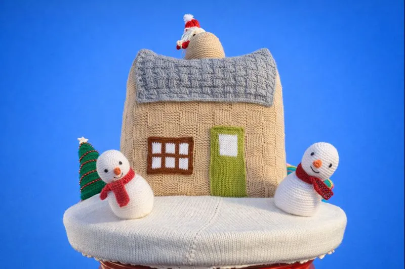
Photo: Colin McLaughlin, CC0, via Wikimedia Commons
There’s a particular kind of December morning I’ve come to love. The sky is a flat white lid, the pavements are slick, and somewhere between the greengrocer and the war memorial a pillar box is wearing a knitted robin. Nobody announces these things. They simply appear overnight, stitched by someone’s nan or the local WI, and they’re gone by January. Photographing them is a gentle project — part treasure hunt, part craft documentary — and it suits an Olympus kit down to the ground.
The appeal isn’t just the wool. It’s the collision of textures: soft, saturated yarn against cast-iron Royal Mail red, often with a bit of tinsel, a zip-tie or a handmade sign. Get it right and you’ve made a small portrait of a place. Get it wrong and you’ve made a muddy snap of a postbox with a hat on.
Why the Olympus kit fits the job
You don’t need much. A body with decent stabilisation, a standard zoom, a short telephoto and — if you have one — a macro lens. That’s it. The OM-D’s in-body stabilisation is genuinely useful here because you’ll often be shooting one-handed while holding an umbrella, or crouching at an awkward angle on a wet kerb.
My default walkaround is the 12-40mm f/2.8 for context and the 45mm f/1.8 for tighter portraits of the topper itself. If the detail is the point — a tiny knitted scarf, a stitched holly leaf, a pom-pom nose — the 60mm macro earns its place. On a Pen body the 45mm feels almost pocketable, which matters when you’re dodging shoppers on a narrow high street.
A word on focal length: resist the urge to go ultra-wide. A 12mm frame turns the postbox into a tiny red dot in a lot of pavement. The sweet spot is usually 25–45mm, where the topper still reads as a character but the street behind it gives you context.
Reading the flat light
British December light is a softbox the size of the sky, and that’s mostly a gift. Wool is a nightmare in hard sun — every fibre casts a micro-shadow and the colours go crunchy. Under cloud, the stitching sits down and behaves.
The catch is contrast. A white sky behind a red postbox will fool your meter into underexposing the subject, so watch your histogram rather than the preview. I tend to shoot a third of a stop hot and pull it back in editing. If the sky is genuinely blown, that’s often fine — a bright, blank background can look deliberately graphic, especially for a tight crop.
Rain is your friend, briefly. Wet wool goes deeper and richer in colour, and the red enamel of the box picks up a lovely sheen. Just don’t hang about: once the topper is properly soaked it sags, and you’re photographing a sad pile of yarn rather than a robin.
The red problem
Royal Mail red is a strange colour to photograph. It can go orange, it can go magenta, and it can clip in the highlights until it looks like plastic. The fix is usually in the white balance: don’t trust auto in mixed street light. Carry a grey card or just set a custom balance off the pavement. In post, pull the red luminance down slightly and nudge hue towards the warmer side if it’s drifting pink.
Don’t fight the saturation of the wool, though. That’s the whole point. Olympus’s Natural picture mode is a good starting place because it keeps reds and greens believable; Vivid can push the yarn into cartoon territory. If you want punch, add it locally rather than globally.
Composing against the box
The postbox is a plinth. Treat it like one. The topper sits on top, so your framing choices are really about what you include around it.
- The tight portrait: fill the frame with the topper, let the red curve of the box anchor the bottom third. Great for a series.
- The street context: step back and include the shopfront, the church gate or the wet road. This is where the picture tells you where you are.
- The detail: get close on the stitching, the button eyes, the little knitted letter. Macro shooters, this is your moment.
- The interaction: someone posting a card, a child pointing, a dog sniffing the base. Wait for it. These frames are gold.
Shoot in portrait as well as landscape. Toppers are vertical subjects and a portrait crop often feels more natural, especially for social or print use.
Approaching the makers
Many toppers carry a small laminated sign: “Made by the Friday Knitters” or “Please do not remove.” That’s an invitation to be curious, not to be intrusive.
If you can identify the group, ask before you publish anything that names them. A quick message to the local Facebook page or parish newsletter usually gets a warm response — most makers are delighted someone noticed. Offer to send a couple of frames. Don’t unwrap, rearrange or “improve” the display for a better shot. And if there’s a collection tin for charity, put something in it.
A compact shot list
One loop of the village, forty minutes, and you’ll come back with a usable set:
- Wide establishing frame of the postbox in its street.
- Mid-shot, three-quarter angle, topper and box.
- Tight portrait of the topper’s face.
- Macro detail — stitching, buttons, a tiny knitted robin.
- A human element: hands posting a letter, a passer-by.
- One deliberately graphic frame: topper against blank sky.
Editing notes
Keep it simple. Correct white balance, recover the red highlights, add a little clarity to the wool without going crunchy, and crop for consistency across the set. A warm split-tone in the shadows can lift the grey pavement without turning the whole thing sepia. If you’re building a zine or a gallery post, a consistent 4:5 crop makes the series feel intentional.
And save the location notes. Next December, the robin will be a snowman, and you’ll want to know where to look.